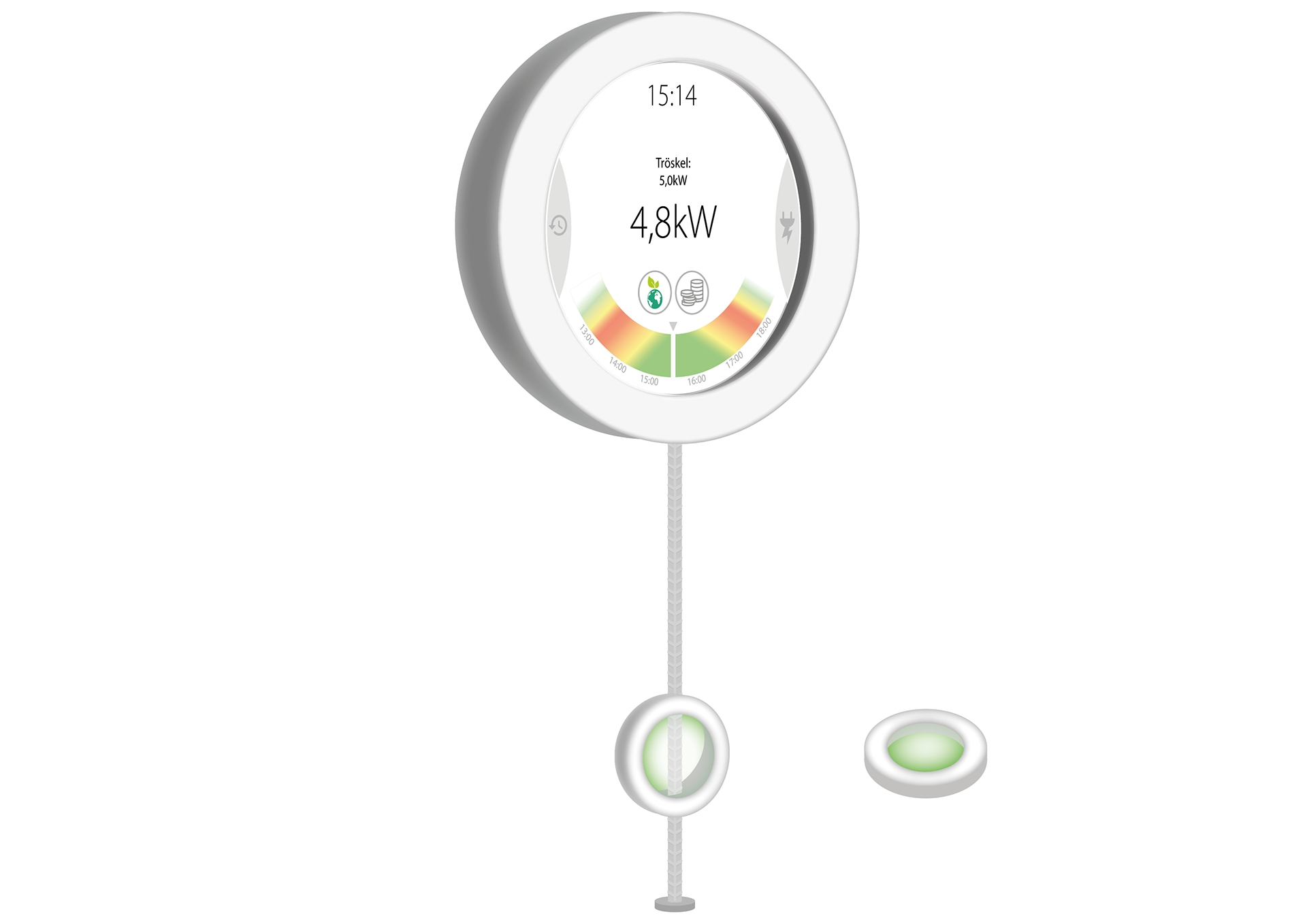
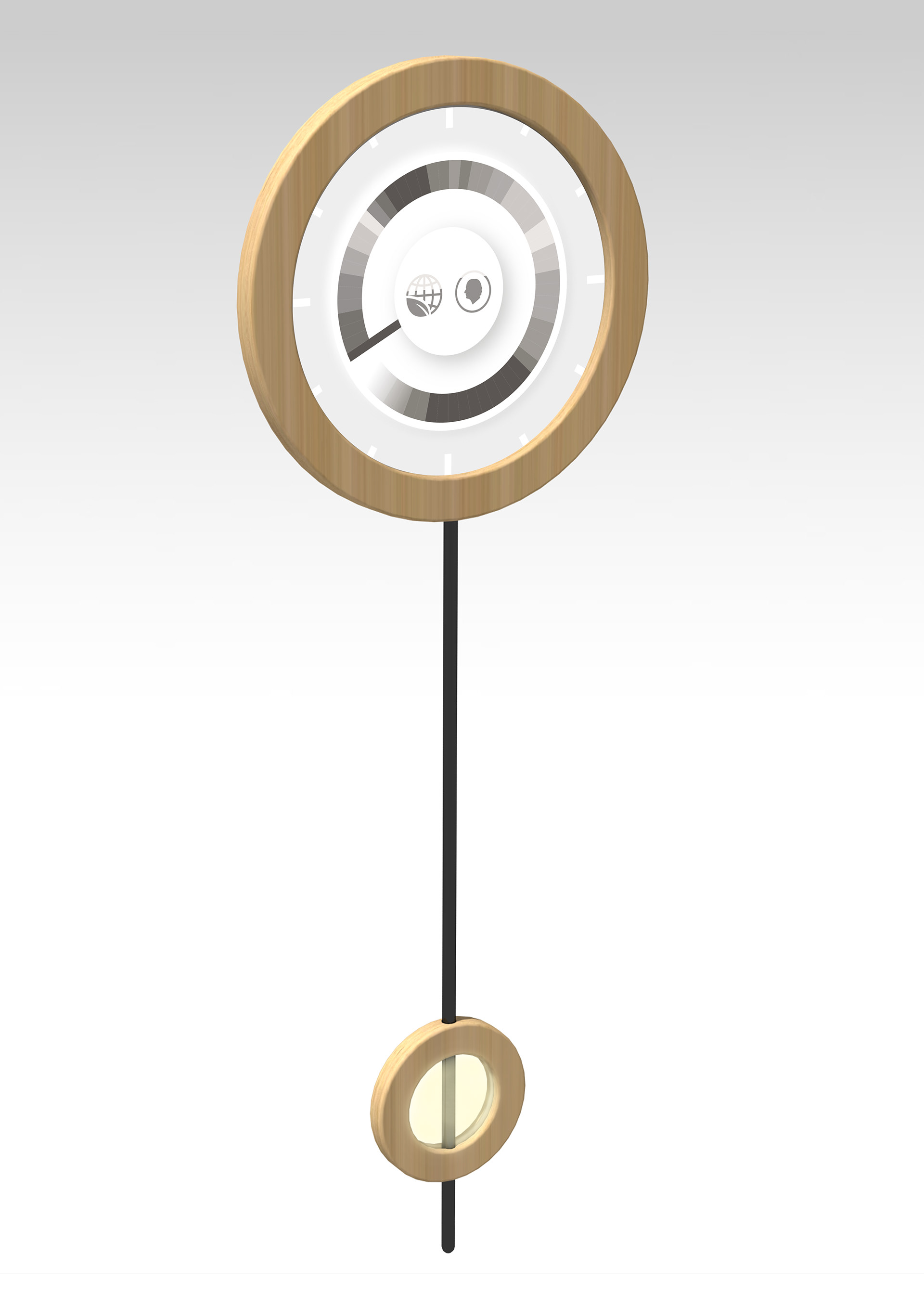
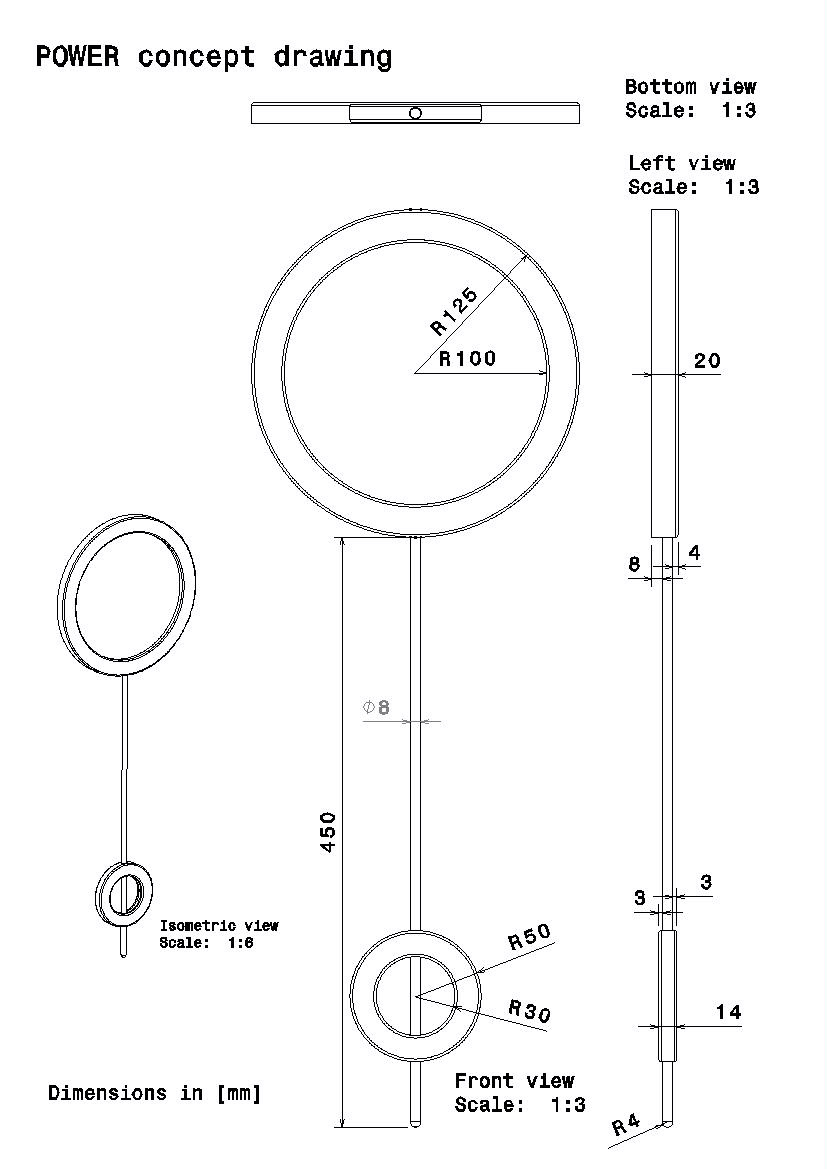
The final concept consists of a wall-mounted device with an E-ink display. Under the display, a ring is placed which moves upwards when electricity consumption in the household is raised, and down when it is lowered.
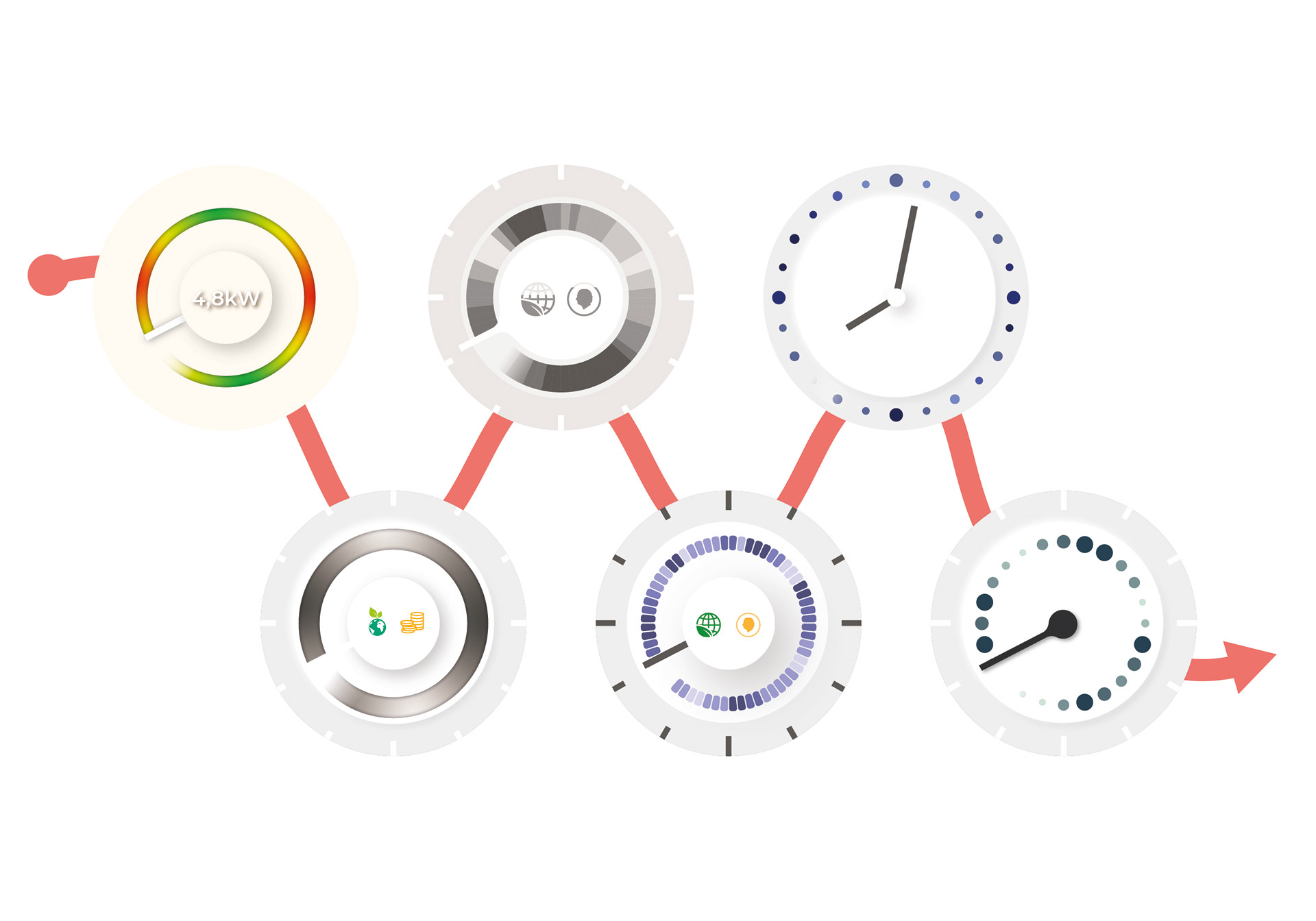
The digital interface mainly consists of four different pages, one of which acts
screensaver. On this screen saver, a forecast of better and worse times to consume electricity is displayed for the coming twelve hours.
screensaver. On this screen saver, a forecast of better and worse times to consume electricity is displayed for the coming twelve hours.
The Process
This was a group project conducted with five other students,
User Study
An initial user study was conducted early in the project. 13 people of different age, gender, housing type, and electricity contract was interviewed. During the interviews, it emerged that both the environment and the economy motivated the participants to reflect
on their electricity consumption. From the user study and other knowledge gathering a list of requirements was constructed.
on their electricity consumption. From the user study and other knowledge gathering a list of requirements was constructed.
Ideation and Concept Generation
Initially, the group carried out brainstorming and brainwriting based on different focus areas. Together with the client, a workshop was then designed with a focus on quantitative ideas. The workshop consisted of both brainstorming and brain-drawing to minimize the risk of missing an important angle. After the quantitative idea generation, the process continued with more detailed and structured sessions focused on realization.
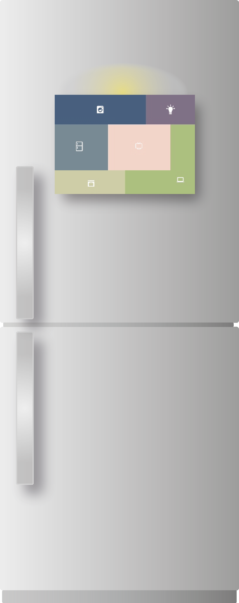
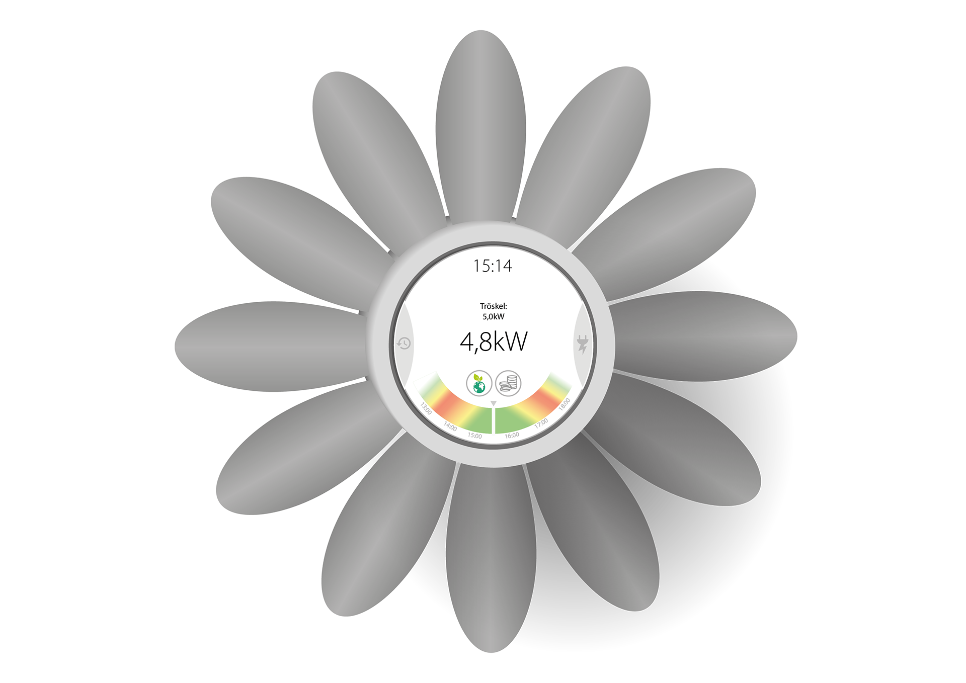
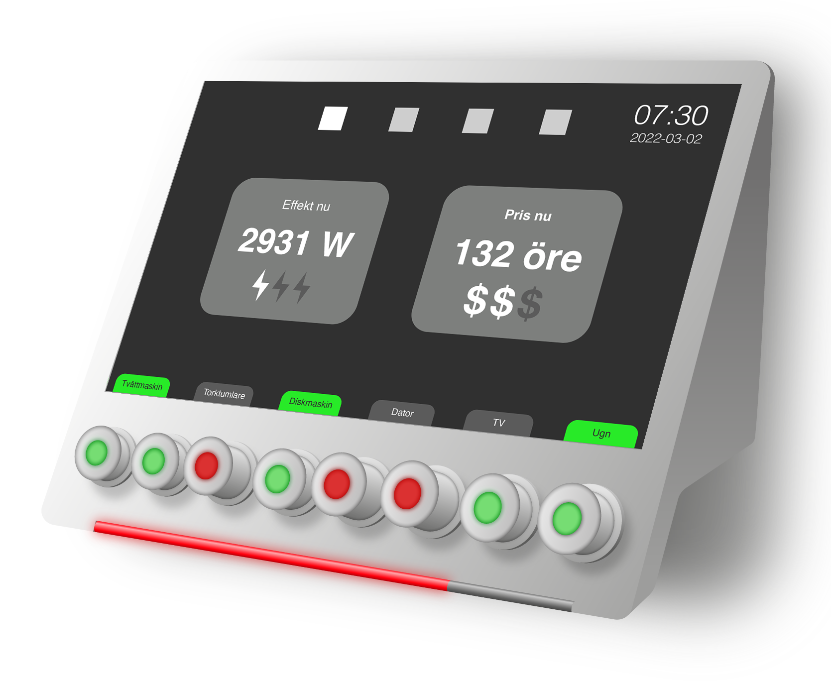
A morphological matrix was designed based on the developed requirements and the result from the idea generation. The purpose of the matrix was to create innovative combinations and broaden ideas. By combining functions and solutions, four new concepts could be created.
Iteration and Prototyping
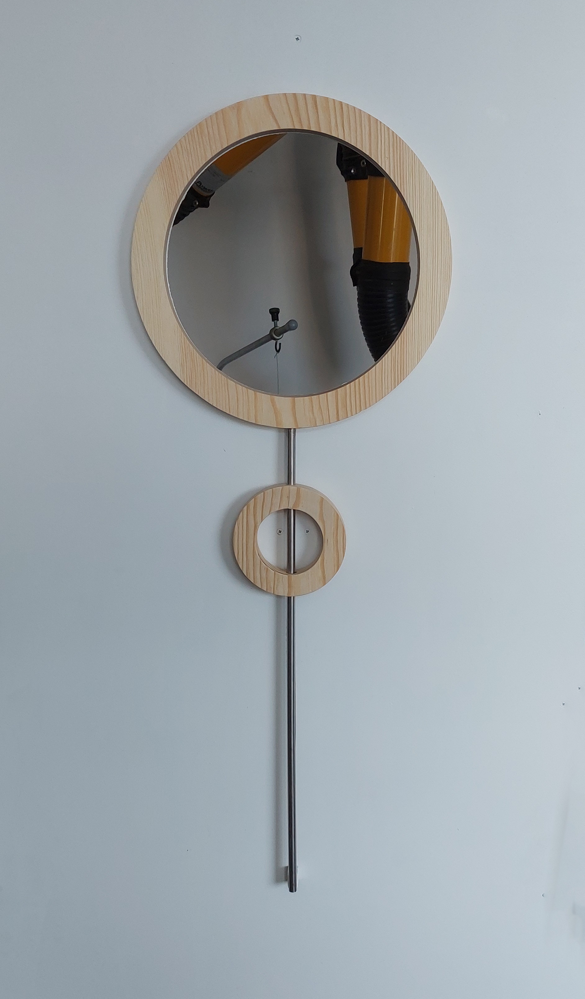
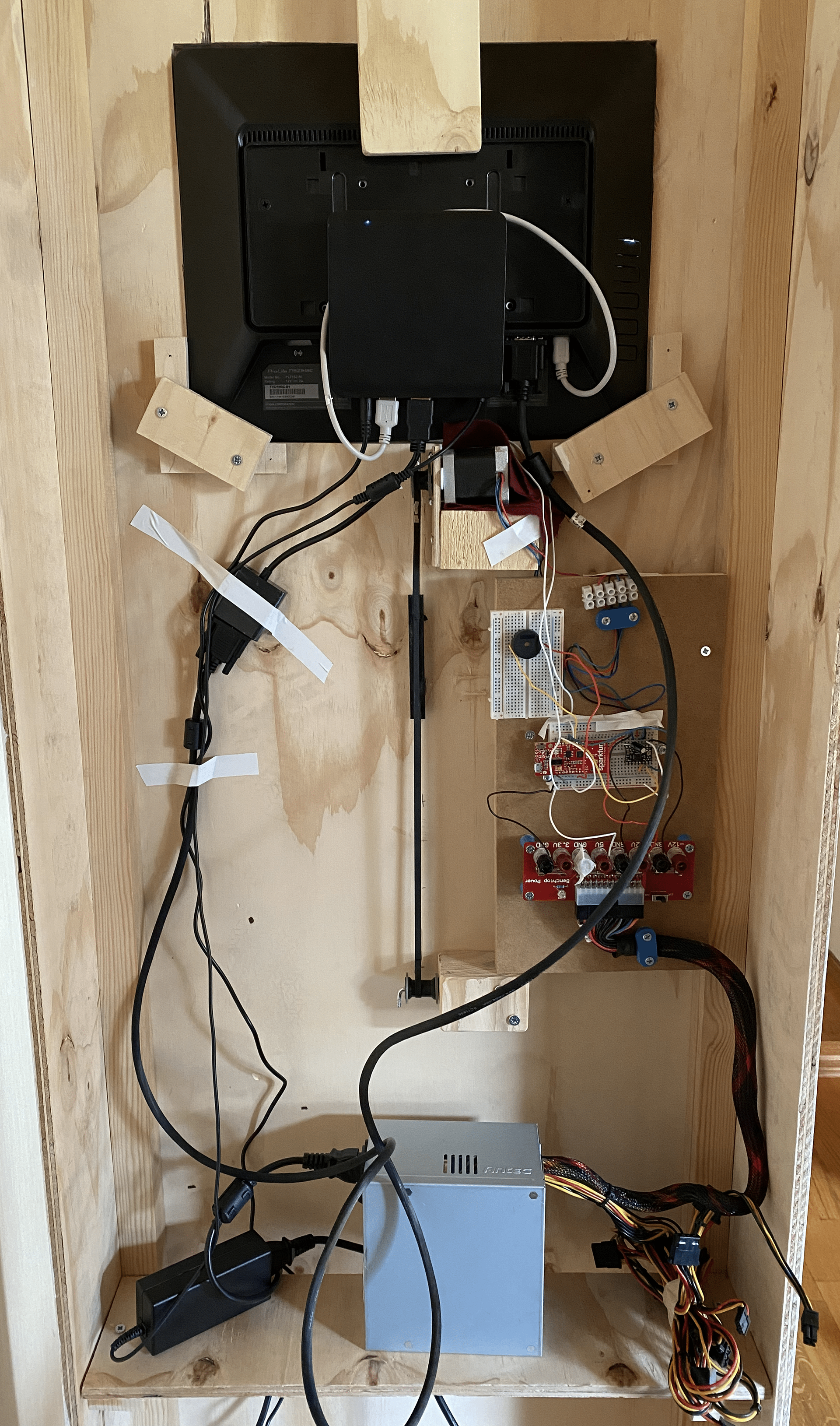
After narrowing down the development to one concept, both the physical and digital were further iterated. Work also began on a digital and physical prototype respectively.
Evaluation with users
With the digital and physical prototypes completed, testing began. Three types of tests were conducted with different goals.
A survey was sent out to get quantitative data on how different colors are perceived, mainly from a gender perspective. This result was the basis for the color choices in the digital interface. A usability test was made on the digital interface to test its learnability. A "full scale" test was also conducted inside a family home with the physical prototype to see if the product had the intended effect.
After testing, a few final adjustments were made to the final result.